REVIEWR
Rate my photo

Rate my photo — and tell me why

Discover the strengths in your photo and what to try next. REVIEWR rates it out of 10 across six weighted categories and explains every score in writing: what worked, what did not, and specific suggestions to improve your photo.

2 free critiques every day, plus free daily and weekly quests. No subscription required.

Or browse real critiques from the community
No credit card required Free Critique — no signup GDPR compliant

How your critique works

One upload becomes a clear score, useful reasoning and a focused way to improve.

01

Upload your photo

Drop in a JPG, PNG or WebP. Try a free preview without an account, then sign up free to see the full feedback.

02

Six areas are assessed

Genre-aware weighting and anchored 1.0–10.0 scores keep every judgement relevant and consistent.

03

Get your score and next step

See what worked, what to improve and your personal action plan. Re-critique later to measure your progress.

See what a full critique looks like

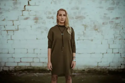
This is a full rating exactly as you receive it: the score out of 10, all six category scores with their reasoning, what works, what to improve, and the action plan.

Urban Stoic
5.0/ 10

Urban Stoic

Pro

This portrait establishes a clear, moody atmosphere through its desaturated palette and textured background. However, the framing choices and flat lighting limit the impact of the subject's strong, direct gaze.

Category scores

🖼️Composition4.8

✓Center placement establishes a formal, static symmetry.

→The frame cuts the subject awkwardly at the lower thighs/knees.

→Excessive headroom leaves the upper third of the image empty and unbalanced.

→The dark crack in the upper left wall pulls the eye away from the subject.

💡Lighting5.2

✓The light is soft and even, avoiding harsh, unflattering shadows.

→The flat direction of the light lacks shaping, making the face appear two-dimensional.

→There is no edge or rim light to separate the subject's dark clothing from the background.

🎨Color & Tone5.4

✓The desaturated grading creates a coherent, moody aesthetic.

→A strong cyan/green cast affects the entire image, making the skin tones appear unhealthy.

→The whites in the brick wall are muddy and lack clean highlights.

✨Creativity4.5

✓The styling and location choice work well together to create an urban vibe.

→The straight-on pose against a brick wall is a very conventional portrait concept.

→The static posture lacks dynamic energy or a unique authorial perspective.

📖Story & Mood5.5

✓The stoic expression and muted tones successfully convey a detached, serious atmosphere.

→The mood relies heavily on the color grading rather than a genuine moment or narrative tension.

⚙️Technical Quality4.8

✓Focus is adequately placed on the subject's face.

→A heavy, artificial-looking vignette darkens the corners distractingly.

→The image lacks crisp micro-contrast, feeling slightly soft overall.

✦ What works

  • •The subject's direct, unwavering gaze creates a strong point of connection with the viewer.
  • •The textured brick wall provides a fitting, gritty backdrop that complements the wardrobe styling.
  • •The muted, desaturated color palette establishes a consistent, melancholic mood.

What to improve

  • →The bottom edge cuts awkwardly across the subject's legs, creating visual tension.
  • →Flat, frontal lighting fails to sculpt the facial features or provide separation from the background.
  • →Excessive negative space above the head diminishes the subject's scale within the frame.
  • →A pervasive cyan/green color cast muddies the whites of the wall and renders the skin tones lifeless.

Your action plan

  1. 1Crop the image tighter (e.g., to a 4:5 ratio) to remove the awkward leg cut and reduce the excessive headroom.
  2. 2Adjust the white balance to remove the green cast and warm up the skin tones.
  3. 3Reduce the intensity of the vignette to make it less distracting.

Need some inspiration?

Your style reminds me of...

Anton Corbijn — Corbijn is a master of gritty, moody portraits. Study how he uses contrast, framing, and subtle subject direction to create compelling images even in simple environments.

What the score actually means

9.0 – 10.0Exceptional

A frame that would hold its own in a published portfolio or competition.

Next step: Enter it. Then study the category notes for the few tenths still available.

8.0 – 8.9Strong

Clearly deliberate work. One or two refinements away from exceptional.

Next step: The written feedback names the refinement — usually in Color & Tone or Story & Mood.

7.0 – 7.9Solid

Well made, but something predictable is holding it back — usually the idea or the light.

Next step: Reshoot the same scene once with the named weakness as your only goal.

5.0 – 6.9Competent

The fundamentals are present; one category is dragging the rest down.

Next step: Apply the specific improvement suggestions for that weakest category before your next session.

Below 5.0Needs work

A core problem in composition, exposure or focus is dominating the frame.

Next step: Fix the single biggest issue named first — one fix per version, then re-critique.

Scores are anchored, not curved. Your photo is measured against what the category describes, never against how many other photos were submitted that day.

A bare rating vs. a REVIEWR score

Plenty of apps will rate your photo — most of them with a small, cheap model that only scratches the surface. Here is what a bare number gives you compared with what the same photo gets here.

A bare rating app

  • What you get

    A single number with no reasoning.

  • The model behind it

    Often a small, cheap model — it flags the obvious flaws and stops there.

  • Staying current

    The model is fixed at launch; a better one either never reaches you or costs extra.

  • The scale

    An unexplained 1–10 or stars — nobody knows what a 6 means.

  • Genre awareness

    Every photo judged by the same generic standard.

  • Consistency

    Scores drift between sessions or depend on other people's submissions.

  • Progress

    You never know if you improved.

  • Cost

    Often freemium with the rating locked behind a paywall.

REVIEWR

  • What you get

    Six weighted category scores plus written strengths, fixes and a personalized action plan.

  • The model behind it

    The strongest vision model available to us today, picked for how well it reads a photo.

  • Staying current

    We move to the best model the day one appears — free critiques included, nothing to upgrade.

  • The scale

    Anchored 1.0–10.0: each band is defined, so a 7.0 always means the same thing.

  • Genre awareness

    Weights shift by genre — lighting counts more in portraits, story more in street.

  • Consistency

    Published criteria explain what each score means, independently of other submissions.

  • Progress

    Re-critique the improved version and see the score delta per category.

  • Cost

    2 free critiques every day, plus free daily and weekly quest entries that do not use your daily allowance. No subscription required.

The six things being rated

Every critique scores these six categories from 1.0 to 10.0 and combines them with the default weights below. Weighting shifts by genre — portraits lean harder on lighting, for example — but the categories never change.

Composition20%
Framing, balance, leading lines, subject placement, and what the edges of the frame do to the eye.
Lighting20%
Direction, quality and shaping of light, exposure decisions, contrast, highlight and shadow control.
Creativity20%
Originality of the idea, the strength of the visual decision, and whether the picture takes a risk that pays off.
Color & Tone15%
Colour harmony, white balance, saturation discipline, and how the tonal treatment supports the subject.
Story & Mood15%
Emotional read, atmosphere, moment, and whether the viewer understands what the photo is about.
Technical Quality10%
Focus and sharpness, noise, artefacts, lens handling, and the cleanliness of the capture and edit.

Frequently asked questions

How can I get my photo rated for free?

Create a free REVIEWR account for 2 photo critiques every day, with six category scores and written feedback. Daily and weekly quest entries are free too and do not use those credits. You can try a preview before signing up. No payment method required.

How do I rate my photo and actually learn from the score?

Choose a photo you would like to improve and try the free preview. A free account unlocks the full feedback: six category scores, written explanations and a personal action plan. Pick a suggestion that fits your creative goal and try it on your next edit or shoot.

What is a good photo score out of 10?

On REVIEWR's anchored scale, 5.0–6.9 is competent — the fundamentals are present but one category is dragging the score down. 7.0–7.9 is solid, 8.0–8.9 is strong deliberate work, and 8.5 or higher is portfolio-grade. Scores below 5.0 mean a core problem — usually composition, exposure or focus — is dominating the frame.

What does the score out of 10 mean?

Each category is scored 1.0–10.0 against fixed anchor descriptors. Roughly: below 5 means a core problem to fix, 5–7 is competent, 7–8.5 is strong work, and 8.5+ is portfolio-grade. The overall score is the weighted combination, not an average.

Is an AI photo rating accurate?

A rating is only as good as the rubric behind it. REVIEWR publishes its rubric, weights and anchor descriptors, and every score comes with the written reasoning that produced it — so you can check the judgement rather than trust the number.

Is my photo rated against other people's photos?

No. Scores are anchored, not curved: your photo is measured against fixed descriptors of what each score means, never against how many other photos were submitted that day.

Rate my photo — free, right now

Discover what makes your photo work with a free preview. Create a free account for the full feedback, 2 critiques every day and free daily and weekly quests on top.

Keep reading