

Deni
Lv. 12 Critique by REVIEWR AI
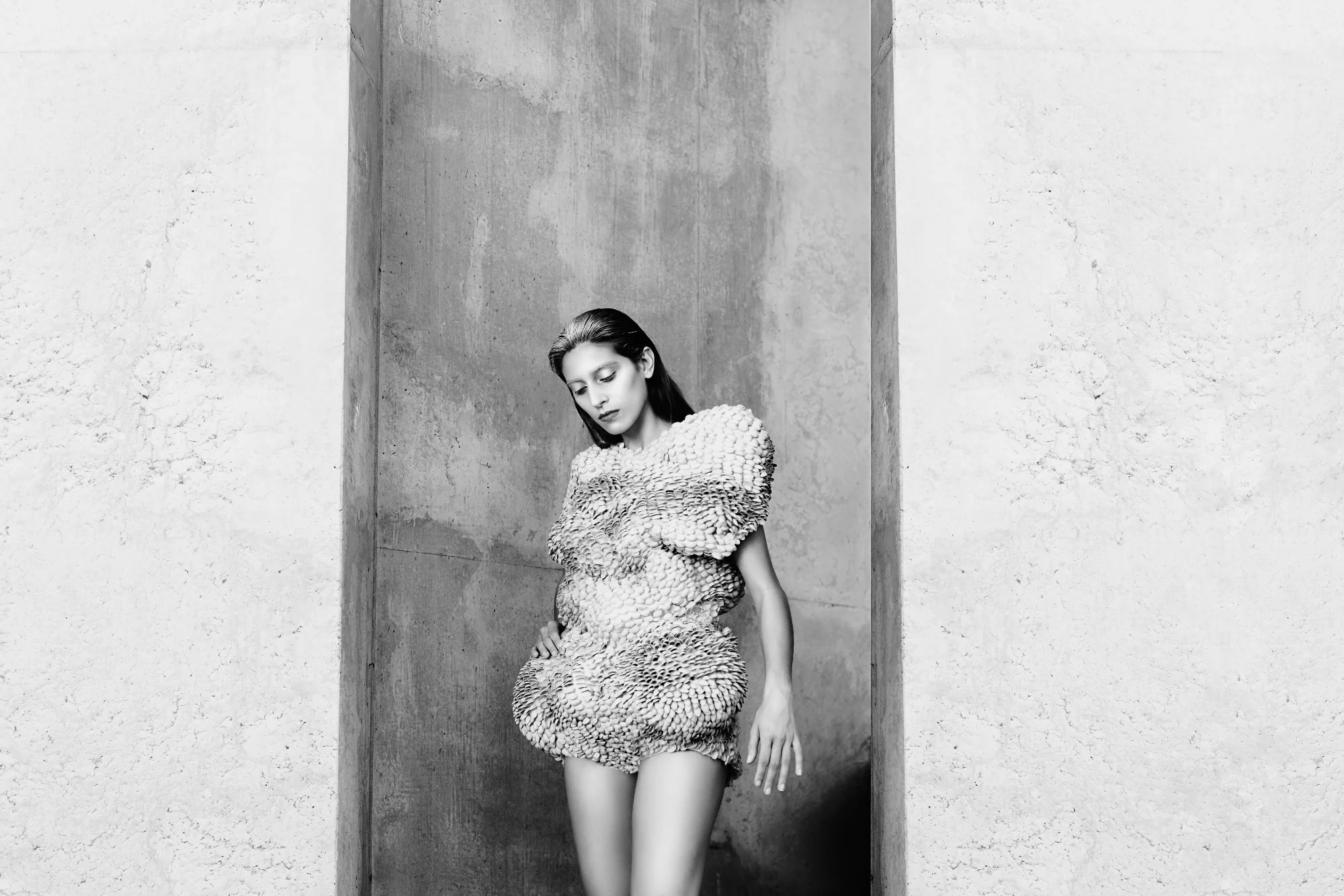
🎯 Less is More - Pistachio
Your interpretation of the 'Less is More' quest is striking, using stark architectural framing to create massive, deliberate negative space. The contrast between the organic texture of the garment and the rigid geometry of the environment makes for a compelling editorial portrait.
What's Working
- ✓The expansive negative space on the flanking walls perfectly executes the minimalist quest theme, forcing all attention onto the subject.
- ✓The black and white treatment emphasizes the incredible texture of the garment and the geometric lines of the setting.
- ✓The soft, directional light models the subject's face beautifully while highlighting the sculptural nature of the outfit.
Room to Grow
- The subject is positioned slightly off-center within the architectural frame, which slightly disrupts the otherwise strong symmetry.low
- The highlights on the outer walls are pushed very close to pure white, losing some of the concrete texture visible elsewhere.low
Category Scores
✓ Brilliant use of architectural framing to create vast negative space
→ The subject's placement within the alcove is slightly asymmetrical
✓ Soft light beautifully defines the complex texture of the garment
→ Highlights on the flanking walls are very bright, bordering on blown out
✓ The B&W conversion perfectly suits the minimalist, structural theme
✓ The downward gaze creates a quiet, introspective atmosphere
✓ Sharp focus on the subject's face and the intricate garment
→ Potential highlight clipping on the outer walls reduces textural detail
✓ Excellent pairing of avant-garde fashion with a stark, brutalist environment
Your Action Plan
Top Actions
- 1Adjust the crop slightly to perfectly center the subject within the vertical opening
- 2Pull back the brightest highlights on the outer walls to recover subtle concrete texture
Need some inspiration?
Your style reminds me of...
Peter Lindbergh
Your stark, high-contrast black and white approach and editorial feel share DNA with Lindbergh's iconic fashion portraits. Study his use of environment and texture.
Like what you see?