

Les Zackler
Lv. 11 · Critique by REVIEWR AI
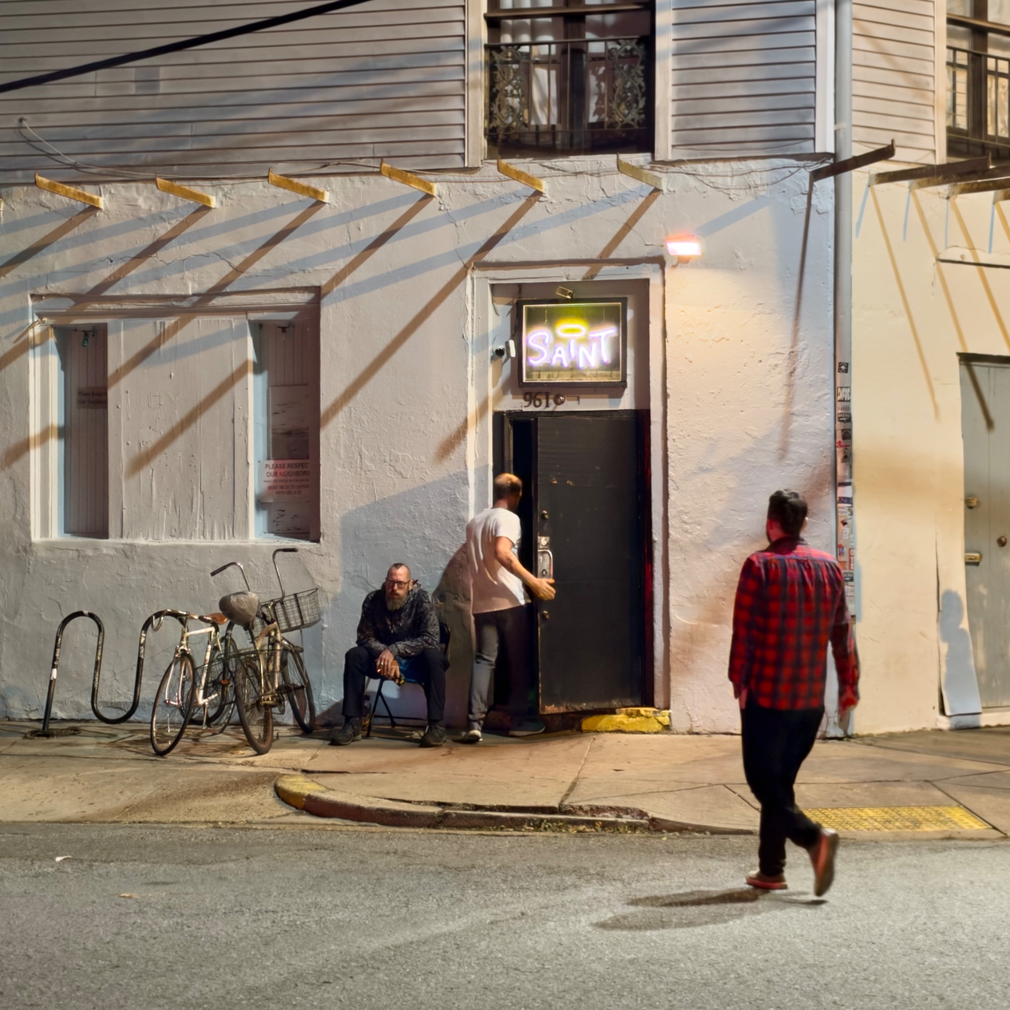
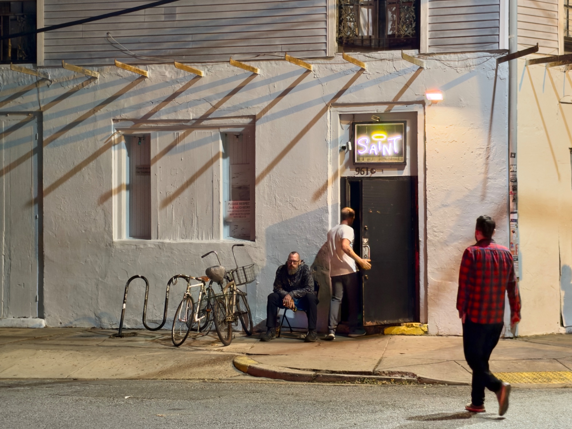
A solid improvement in composition. The new crop solves the primary framing issues identified previously, making the image feel much more intentional and balanced, even though the technical limitations of the original capture remain.
What improved
- • The framing is much better balanced with the new square crop, removing the dead space on the left.
- • The walking figure on the right now has more breathing room, fixing the awkward edge tension noted in the previous critique.
Still to work on
- • The motion blur on the moving figures is still present, as this is a re-framing of the same capture.
- • The harsh lighting on the white wall remains.
Outside the Saint
This is a moody, atmospheric slice of night street photography. The new square crop significantly improves the balance, giving the walking figure room to breathe while tightening the focus on the bar entrance.
What's working
- ✓The square crop effectively balances the frame, removing dead space on the left and giving the walking figure on the right necessary breathing room.
- ✓The strong diagonal shadows cast on the building facade create excellent graphic interest and lead the eye toward the subjects.
- ✓The neon 'SAINT' sign acts as a strong focal point and adds a layer of narrative irony to the gritty street scene.
Room to grow
- The motion blur on the walking figures (especially the man in plaid) remains distracting and reduces the overall sharpness of the scene.high
- The harsh overhead lighting blows out some detail on the white wall above the door.medium
Category Scores
✓ Improved balance with the square crop
→ The figures still feel slightly disconnected visually from one another
✓ Graphic shadows add drama and structure to the frame
→ Harsh hot spots on the white wall from the streetlamp
✓ Captures the authentic, gritty color palette of mixed street lighting
→ The overall tone leans a bit muddy and yellow due to the streetlights
✓ Strong sense of place and urban atmosphere
→ The narrative connection between the three men remains ambiguous
✓ Focus on the seated man and the building facade is acceptable
→ Noticeable motion blur on the moving subjects due to a slow shutter speed
✓ Good eye for spotting the graphic potential of the shadows
→ The scene is a familiar street photography setup without a highly unique perspective
Your Action Plan
TOP ACTIONS
- 1Burn (darken) the brightest highlights on the white wall above the door to recover some texture
- 2Apply selective sharpening or clarity to the moving figures to mitigate the blur slightly, though it cannot be fully fixed
Need some inspiration?
Your style reminds me of...
Alex Webb
Webb is a master of complex, multi-subject street scenes with strong shadows and vibrant, mixed lighting. Studying his work can help you organize multiple figures within a frame.
Like what you see?