

arrowood
Lv. 4 Critique by REVIEWR AI
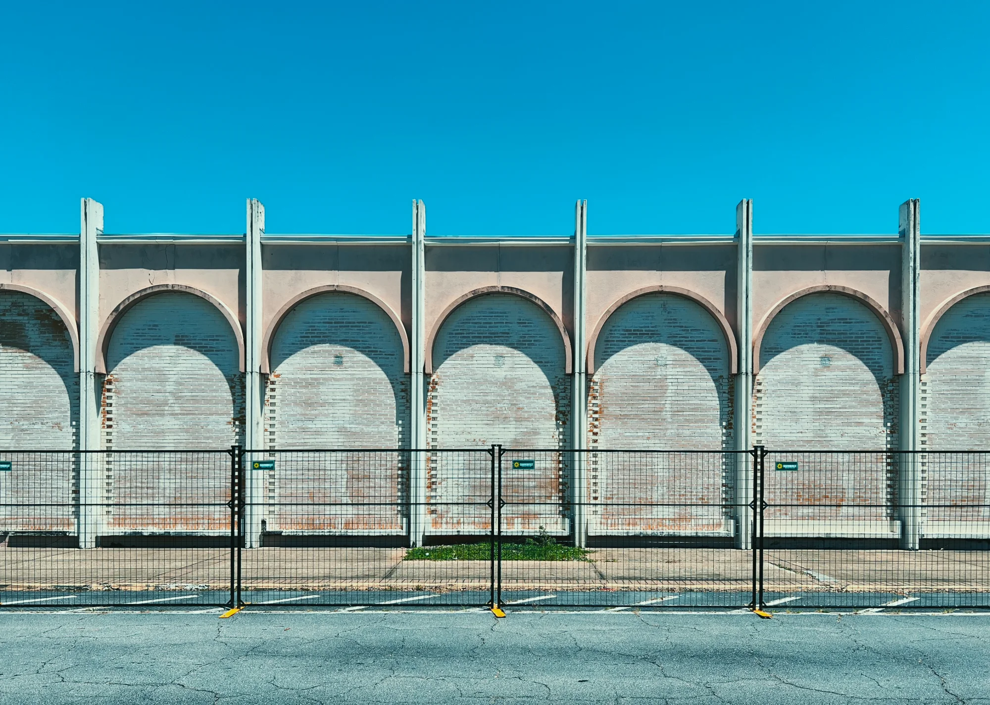
Death row
You've successfully found the beauty in decay, exactly as you intended. The rigorous symmetry and striking color palette elevate this soon-to-be-demolished structure into a compelling graphic study. Correcting a minor perspective distortion will make the geometry truly flawless.
What's Working
- ✓The flat, symmetrical composition turns the repeating arches into a strong visual rhythm.
- ✓The teal and peach color palette adds a nostalgic, cinematic feel that perfectly suits the 'outdated' theme.
- ✓The inclusion of the temporary fence effectively communicates the narrative of impending demolition.
Room to Grow
- Slight perspective distortion causes the vertical pillars on the far left and right to lean inward.low
- The large expanse of empty sky at the top slightly dilutes the focus on the building's textures.low
Category Scores
✓ Rigorous, flat-on symmetry emphasizes the architectural pattern
→ The amount of negative space in the sky slightly overpowers the structure
✓ Hard, direct sunlight creates defined shadows that emphasize the depth of the arches
✓ The teal sky and faded peach/pink facade create a striking complementary color scheme
✓ The barrier fence instantly communicates the 'about to be torn down' narrative
✓ Sharp focus across the entire facade
→ Slight perspective distortion causes the outer vertical pillars to lean inward
✓ Applying a stylized aesthetic to a decaying mall is a fresh take
Your Action Plan
Top Actions
- 1Apply a slight vertical perspective correction to make the outer pillars perfectly straight
- 2Experiment with a 16:9 or panoramic crop to reduce the sky and emphasize the horizontal span of the building
Need some inspiration?
Your style reminds me of...
Matthias Heiderich
Your use of flat, symmetrical framing and pastel-leaning, complementary colors to turn architecture into a graphic pattern is very reminiscent of Heiderich's work.
Like what you see?