

Edwar
Lv. 1 · Critique by REVIEWR AI
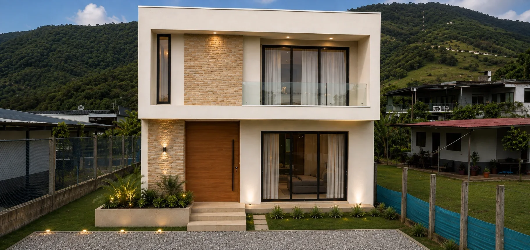
AI architecture photo critique — 5.7/10
This is a clean, straightforward architectural elevation that effectively uses mixed lighting to create an inviting atmosphere, though the framing and background details hold it back from a professional standard.
What's working
- ✓Effective balancing of warm artificial light with cool ambient twilight
- ✓Strict adherence to straight verticals, essential for architecture
- ✓Clear, unobstructed view of the primary facade
Room to grow
- The crop at the top is uncomfortably tight, suffocating the roofline.high
- Neighboring structures on the left and right introduce visual clutter that competes with the main subject.medium
- Repetitive, unnatural textures in the background hills distract from the realism of the scene.medium
- Flat ambient lighting on the front facade fails to emphasize the building's depth and volume.low
Category Scores
✓ Centered, one-point perspective provides a clear, objective view of the design
→ The roofline is pinched against the top edge of the frame, lacking necessary breathing room
✓ Successful blending of warm interior/exterior fixtures with cooler twilight ambient light
→ The ambient light on the facade is flat, doing little to model the depth of the balconies or the texture of the stone
✓ Pleasing warm/cool color contrast between the house and the environment
→ The greens in the background hills feel slightly uniform and overly saturated
✓ The warm lighting successfully conveys a sense of comfort and modern living
→ The mood is generic to real estate marketing, lacking a deeper narrative or atmospheric tension
✓ Vertical lines are kept strictly parallel, showing good perspective control
→ Highly repetitive, artificial-looking textures in the background hills severely undermine the image's realism
✓ Executes the standard real estate elevation shot competently
→ The straight-on, eye-level approach is purely documentary and lacks a unique photographic perspective
Your Action Plan
TOP ACTIONS
- 1Add canvas size or crop wider at the top to give the roofline breathing room
- 2Crop tighter on the sides or use a different angle to eliminate the messy neighboring properties
- 3Address the unnatural repeating patterns in the background hills
Need some inspiration?
Your style reminds me of...
Julius Shulman
Shulman was a master of capturing modern architecture. Study how he used dramatic angles, precise framing, and environmental context to elevate buildings beyond mere documentation.
Like what you see?