

Liman
Lv. 3 Critique by REVIEWR AI
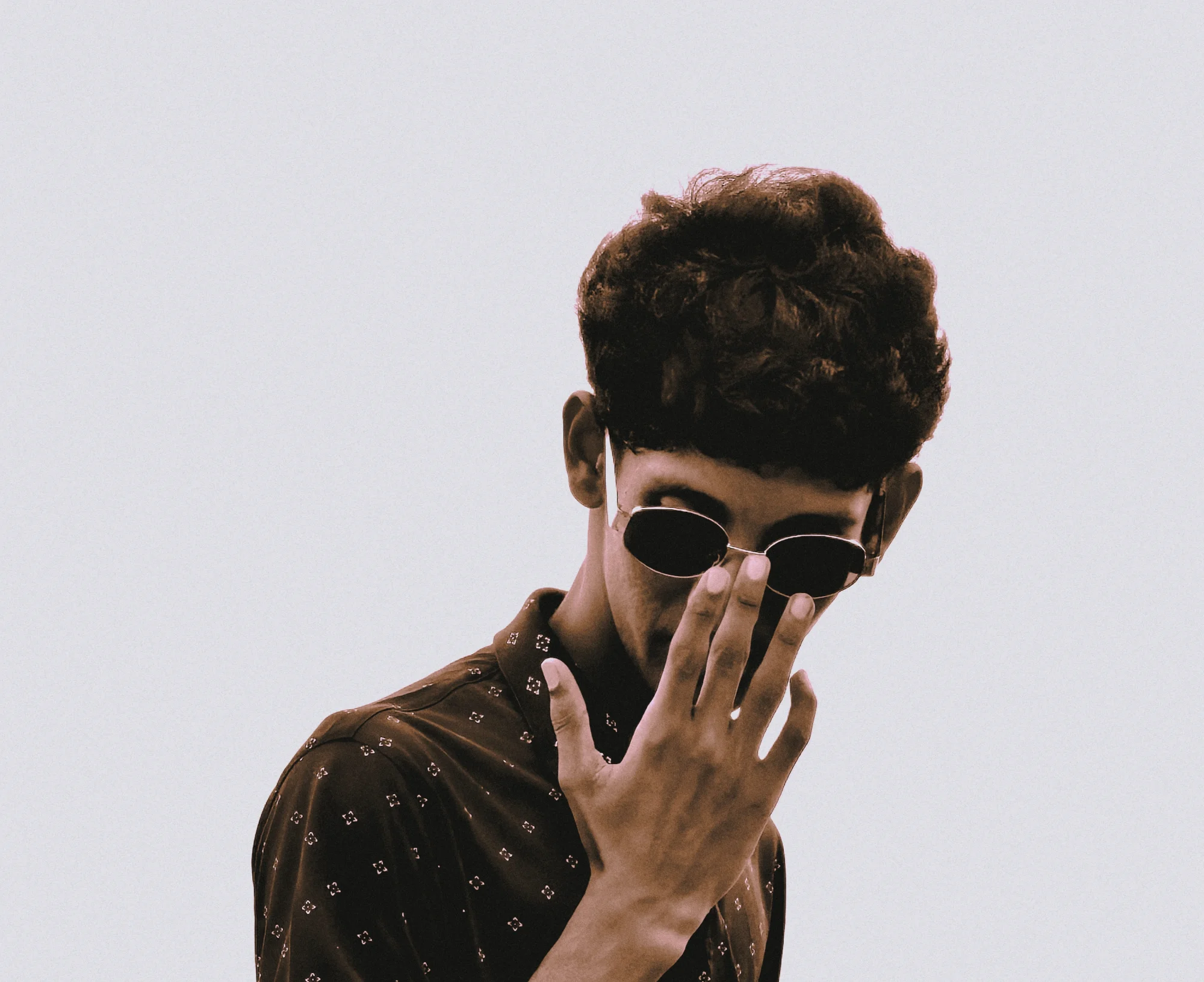
Sepia Contemplation
This portrait establishes a clear, moody aesthetic through its stylized pose and heavy processing. However, the aggressive color grading and destructive noise level overpower the subject, turning what could be an intimate moment into a surface-level stylistic exercise.
What's Working
- ✓The hand gesture creates a strong visual anchor that leads the eye directly to the face.
- ✓The downward gaze and obscured eyes effectively project a sense of introspection and aloofness.
Room to Grow
- The severe noise and heavy color grade degrade image quality and render skin tones muddy.high
- The flat, directionless lighting fails to give the subject dimensionality.medium
- The bottom crop awkwardly severs the forearm, while the negative space above feels unbalanced.medium
Category Scores
✓ The hand placement creates a natural leading line to the subject's face.
→ The bottom edge awkwardly severs the forearm.
✓ The flat lighting avoids harsh, unflattering shadows across the face.
→ The light lacks direction, leaving the subject looking two-dimensional.
✓ The monochromatic treatment creates a unified, albeit heavy, aesthetic.
→ The aggressive color grade renders the skin tones muddy and lifeless.
✓ The downward gaze and obscured eyes project a clear sense of introspection.
→ The heavy-handed processing distracts from the subtle emotion of the pose.
✓ Focus appears to be correctly placed on the hand and face.
→ Severe, destructive noise obliterates fine detail across the entire image.
✓ The pose and styling show a clear attempt to create a specific persona.
→ The execution relies too heavily on post-processing filters rather than in-camera vision.
Your Action Plan
Top Actions
- 1Apply noise reduction in post to clean up the destructive grain.
- 2Crop the top of the frame to reduce the unbalanced negative space.
- 3On your next shoot, use a reflector or window to introduce directional light and shape the face.
Need some inspiration?
Your style reminds me of...
Anton Corbijn
Corbijn often uses heavy grain, high contrast, and moody poses, but maintains strong compositional structure and intentional lighting to support the aesthetic without letting the processing overpower the subject.
Like what you see?