


Deni Dedic
Lv. 10 · Critique by REVIEWR AI
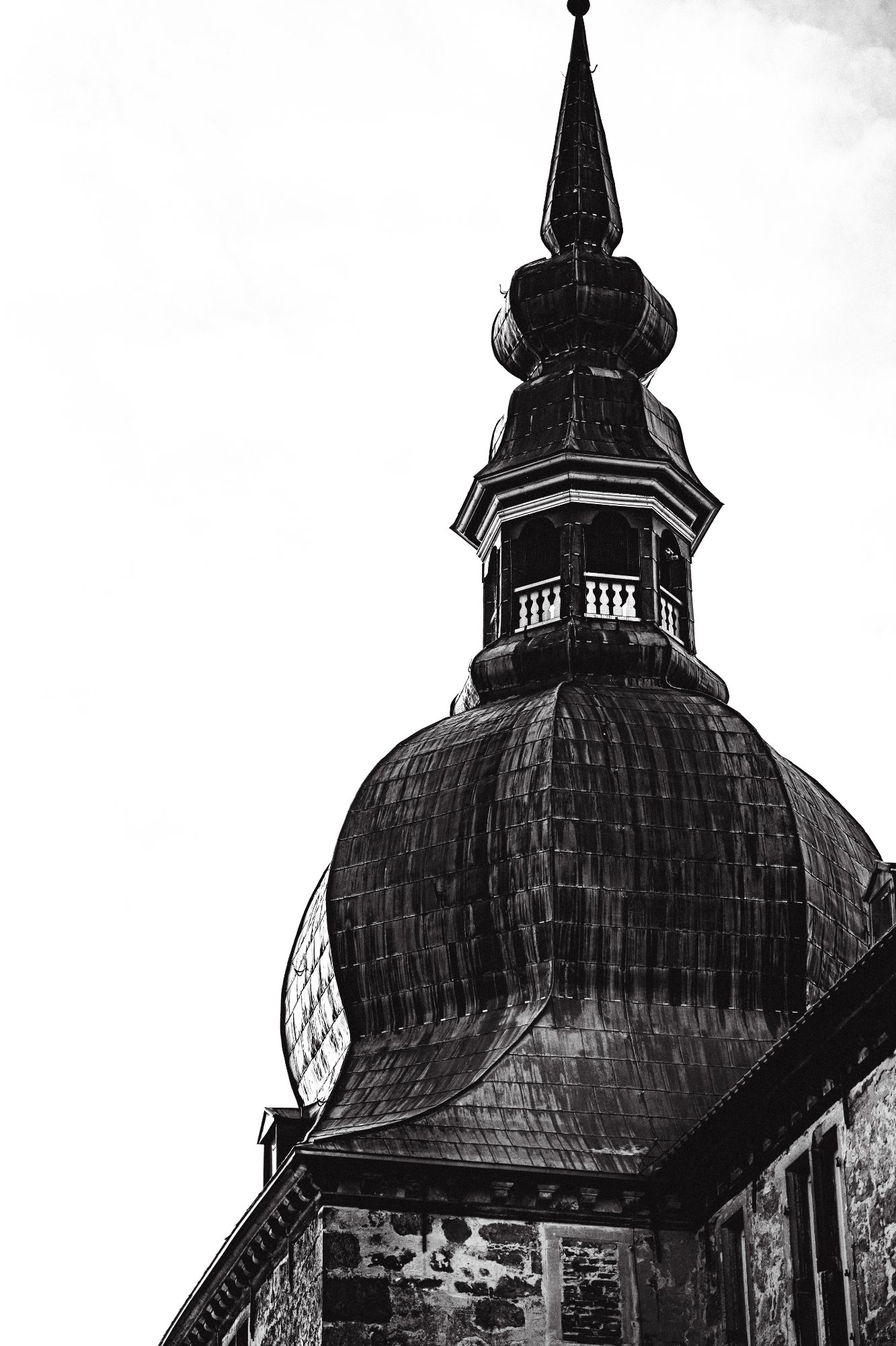
Baroque Tower
Your commitment to a high-contrast, graphic aesthetic effectively emphasizes the intricate textures of the Baroque masonry against the negative space of the sky.
What's working
- ✓Bold use of negative space creates a striking silhouette
- ✓Excellent extraction of texture from the weathered shingles and stonework
- ✓Strong verticality that guides the viewer's eye upward
Room to grow
- The highlights in the sky are completely blown, resulting in lost edge definition at the top of the spirehigh
- The composition feels slightly cramped at the bottom right; the transition to the building base is abruptmedium
- Chromatic aberration or 'fringing' is visible along the high-contrast edges of the towermedium
Category Scores
✓ Dynamic diagonal placement of the tower base
→ Give the spire more 'breathing room' at the top
✓ Harsh lighting supports the 'gritty' intent
→ Manage the dynamic range to avoid 'clipping' the whites
✓ The B&W conversion is punchy and deliberate
→ Introduce a slight split tone to add depth to the shadows
✓ Center of the dome shows crisp architectural detail
→ Edge sharpness degrades at the extreme highlights
✓ Successfully achieves the 'gritty vs. clean' contrast requested
→ The 'clean' sky feels more like 'missing' data due to overexposure
✓ Intentional post-processing style
→ Heavy digital noise/grain in the dark stone areas
Your Action Plan
TOP ACTIONS
- 1Re-shoot or re-edit to recover the 'lost' edges of the spire against the white sky
- 2Apply lens correction profiles to remove the purple/green fringing on the silhouette
Like what you see?