

TidyGround
Lv. 3 · Critique by REVIEWR AI
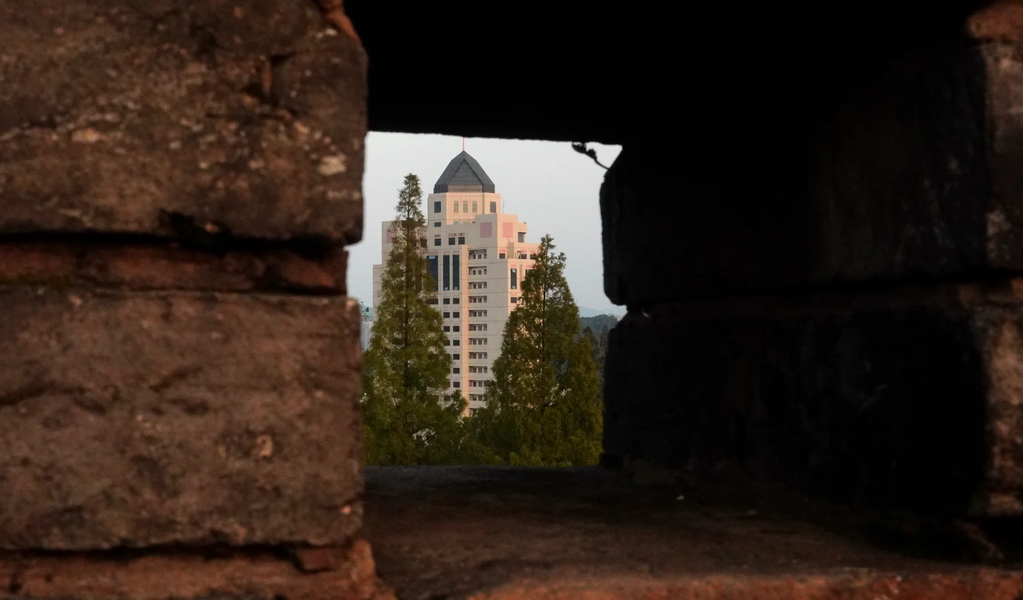
城墙上窥见高楼
You absolutely nailed your intent here; the juxtaposition of the rough, ancient wall framing the clean lines of the modern building creates a powerful visual representation of time passing.
What's working
- ✓Excellent use of a frame-within-a-frame to tell a story.
- ✓The concept directly and successfully addresses your goal of blending ancient and modern.
- ✓The depth created by the out-of-focus foreground draws the eye straight to the subject.
Room to grow
- The heavy, detail-less black area on the right side of the frame unbalances the composition slightly.medium
- Visible noise and a lack of critical sharpness on the distant building reduce the overall technical quality.medium
Category Scores
✓ The frame-within-a-frame technique is used very effectively to isolate the subject.
→ The large mass of pure black on the right side feels a bit heavy compared to the textured brick on the left.
✓ The silhouette effect of the wall creates immediate depth.
→ The light on the background building is quite flat, lacking dimensionality.
✓ The contrast between the warm, earthy tones of the old wall and the cooler tones of the modern scene supports the narrative.
→ The overall color palette feels a bit muddy and lacks vibrancy.
✓ The image immediately communicates a sense of history and the passage of time.
✓ The exposure is balanced well enough to keep the background from blowing out while keeping the foreground dark.
→ There is significant, distracting luminance noise visible, especially in the darker areas and the sky.
✓ A very clear and successful execution of your specific creative intent.
→ While effective, the 'looking through a hole in a wall' trope is a familiar way to show this concept.
Your Action Plan
TOP ACTIONS
- 1Apply noise reduction in post-processing to clean up the sky and shadow areas.
- 2Consider a slight crop from the right side to reduce the dominance of the pure black area.
- 3Apply subtle sharpening to the background building.
Need some inspiration?
Your style reminds me of...
Fan Ho
Fan Ho was a master of using light, shadow, and architectural framing to create dramatic, narrative-driven images of urban environments. Studying his work can give you ideas on how to use heavy shadows more dynamically.
Like what you see?