

kyomu
Lv. 8 · Critique by REVIEWR AI
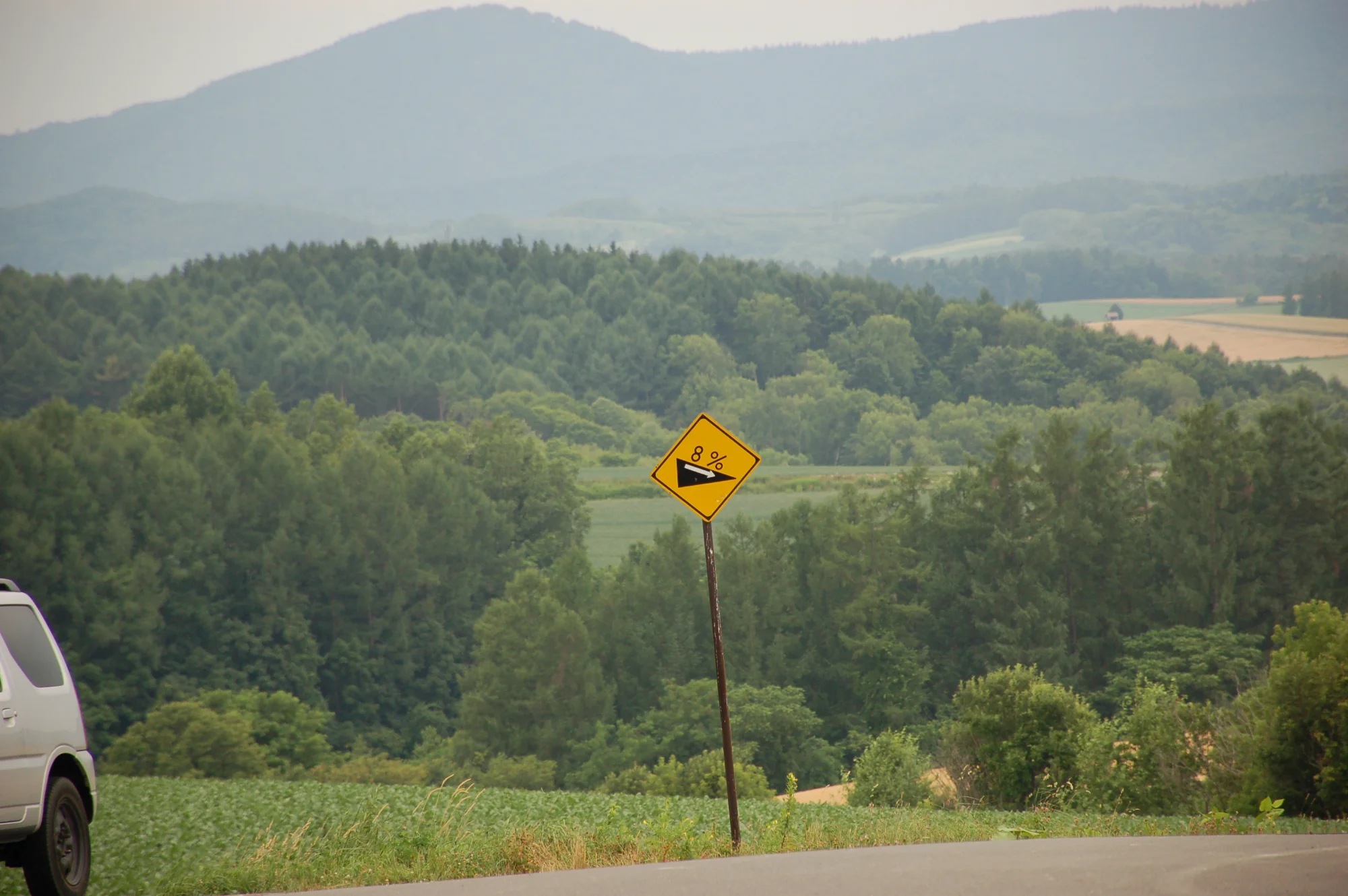
注意斜坡
You set out to capture 'just a sign,' and you've certainly made it the clear focal point of this rural scene. The layered landscape provides a nice backdrop, though a few framing and technical details hold the image back from its full potential.
What's working
- ✓The bright yellow sign provides excellent color contrast against the green landscape
- ✓The layered hills create a strong sense of depth and scale
Room to grow
- The car on the left edge is a major distraction that breaks the compositionhigh
- Heavy vignetting darkens the corners significantlymedium
Category Scores
✓ The layered hills create a natural sense of depth behind the subject
→ The car on the left edge is a major distraction that pulls the eye away from the sign
✓ The soft, overcast light prevents harsh shadows on the landscape
→ The flat lighting doesn't provide much shape or dimension to the scene
✓ The bright yellow sign pops effectively against the muted greens of the forest
→ The atmospheric haze washes out the background colors, making them feel a bit muddy
✓ The hazy mountains evoke a quiet, rural road trip atmosphere
→ The accidental inclusion of the car breaks the immersion of the natural landscape
✓ The sign itself is in acceptable focus
→ Heavy vignetting is very visible in the corners
✓ Using a telephoto focal length compresses the background nicely behind the sign
→ The execution is very literal, matching your intent but lacking a unique perspective
Your Action Plan
TOP ACTIONS
- 1Crop the image from the left to completely remove the car
- 2Apply lens correction to fix the dark vignetting in the corners
Need some inspiration?
Your style reminds me of...
William Eggleston
Eggleston is a master of finding striking color and composition in mundane, everyday objects like road signs. Studying his work can show you how to elevate 'just a sign' into a compelling piece of art.
Like what you see?