

nad
Lv. 3 Critique by REVIEWR AI
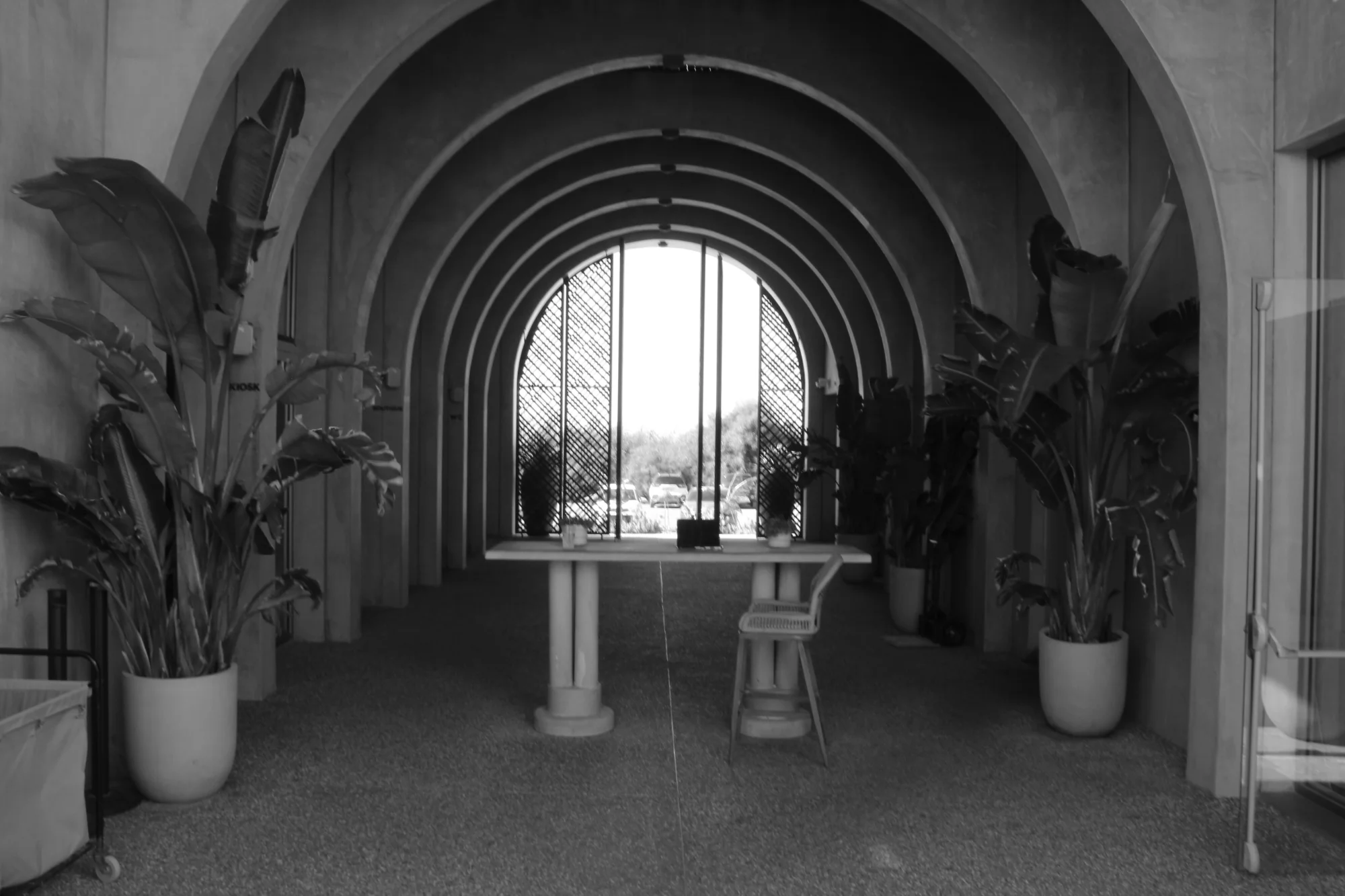
Archway Shadows
You have a great eye for architectural geometry, using the repeating arches to draw the viewer deep into the frame. However, the challenging lighting and technical settings have resulted in a muddy image that hides the beauty of the space.
What's Working
- ✓The repeating arches create excellent depth and natural leading lines that pull the eye straight to the center.
- ✓The choice of black and white helps emphasize the shapes and structure of the corridor without color distractions.
Room to Grow
- The image is overall very soft and muddy, lacking crisp contrast and sharpness.high
- The framing is slightly asymmetrical, and the glass edge on the right is distracting.medium
Category Scores
✓ Repeating arches create strong leading lines
→ Framing is slightly off-center, breaking the intended symmetry
✓ Backlight creates a clear destination for the eye at the end of the tunnel
→ Interior is heavily underexposed, losing detail in the shadows
✓ Monochrome conversion suits the geometric subject well
→ Tonal range is compressed into muddy grays
✓ The empty chair and table suggest a quiet, waiting moment
→ The flat, murky tones dampen the potential atmosphere and make it feel a bit lifeless
✓ Depth of field is deep enough to cover the entire scene
→ Overall softness, likely from camera shake at 1/20s
✓ Recognized a strong geometric pattern in the environment
→ A very conventional, straight-on approach to a tunnel perspective
Your Action Plan
Top Actions
- 1Increase contrast and set a true black point in editing to remove the muddy look
- 2Crop the right edge to remove the glass door and improve symmetry
- 3Next time, use f/8 and a faster shutter speed for sharper results
Need some inspiration?
Your style reminds me of...
Julius Shulman
Shulman was a master of architectural photography. Study how he balanced interior and exterior light and used precise, symmetrical framing to showcase structures.
Like what you see?