

Les Zackler
Lv. 12 Critique by REVIEWR AI
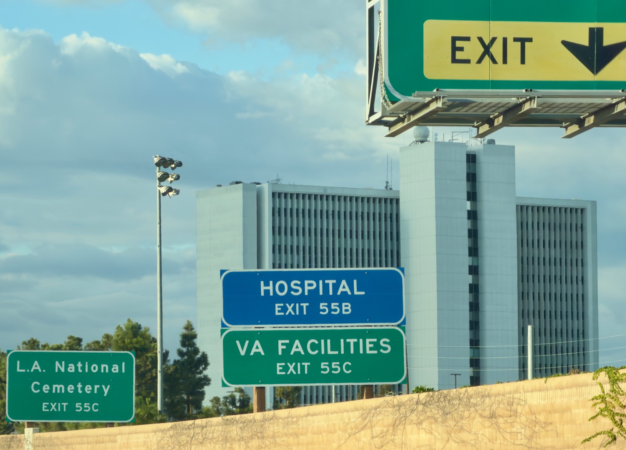
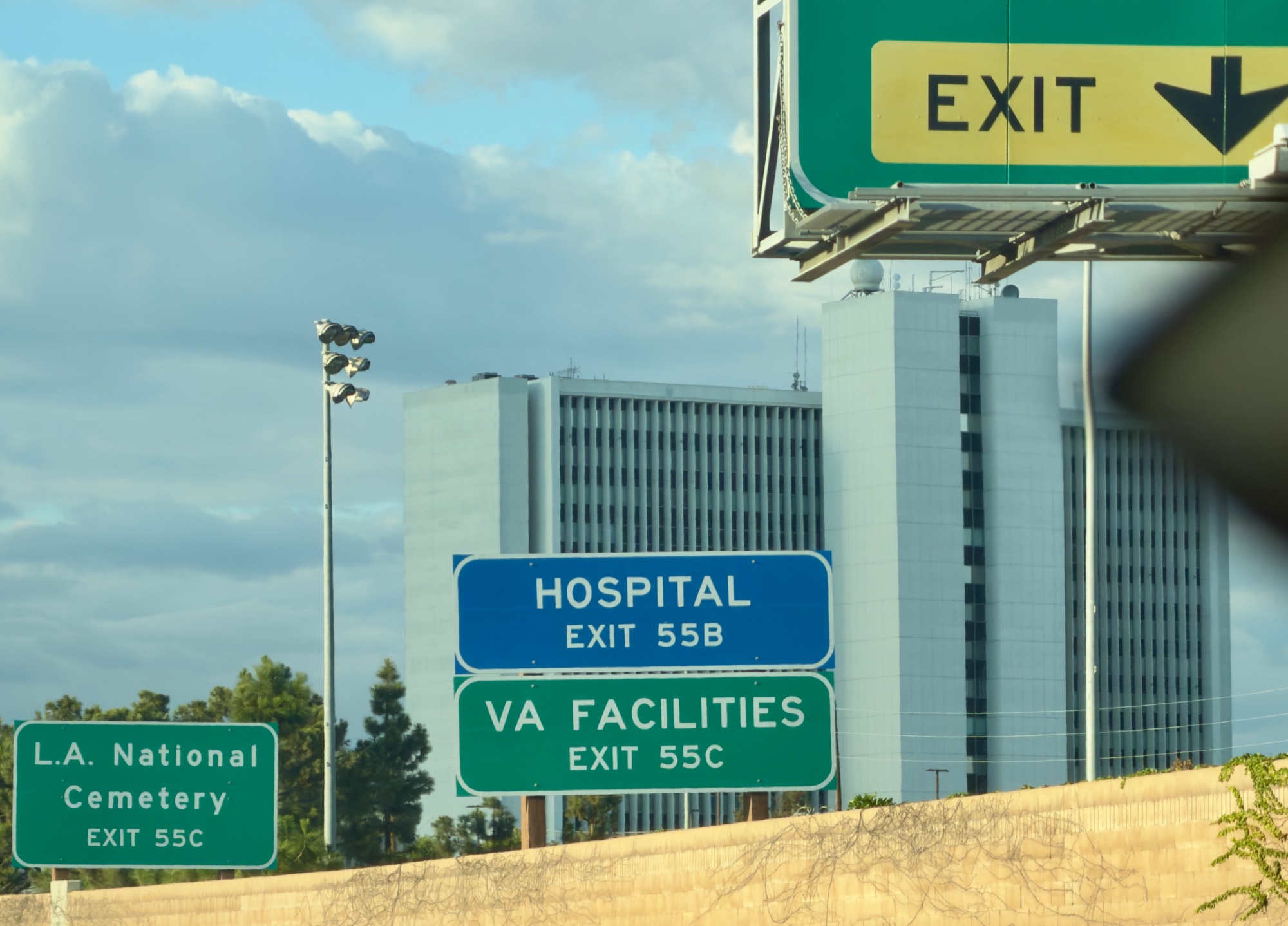
A significant improvement over the previous version due to the removal of the major visual obstruction. The image is now much cleaner, though it still struggles with framing issues at the top edge and an overall snapshot aesthetic.
What improved
- • The large, blurry obstruction on the right side of the frame has been completely removed, drastically cleaning up the image.
Still to work on
- • The top 'EXIT' sign is still abruptly cut off by the upper edge of the frame.
- • The image still carries the feel of a quick snapshot taken from a moving vehicle.
Highway Exits
This image captures a familiar slice of urban transit, effectively documenting the layered infrastructure of the highway. Removing the foreground obstruction was a great step, though the framing still feels a bit like a quick snapshot rather than a deliberate composition.
What's Working
- ✓The frame is now much cleaner, allowing the viewer to clearly read the signs and see the architecture.
- ✓The colors of the highway signs pop nicely against the softer blues and grays of the sky and building.
Room to Grow
- The top 'EXIT' sign is abruptly cut off by the upper edge of the frame, creating awkward tension.high
- The overall composition feels cluttered, lacking a clear primary subject or visual hierarchy to guide the eye.medium
Category Scores
✓ The removal of the large foreground obstruction significantly improves the readability of the scene.
→ The top sign is clipped by the upper frame edge.
✓ The even daylight ensures all elements are clearly visible without harsh shadows.
→ The light is flat and inherited, failing to add shape, dimension, or mood to the architecture.
✓ The greens and blues of the signs are rendered accurately and provide a nice contrast.
→ The overall palette feels neutral and unedited, reading more like a documentary record than an expressive choice.
✓ Conveys a clear sense of travel and navigating a complex urban environment.
→ Lacks a strong narrative or emotional hook to engage the viewer beyond surface-level documentation.
✓ The major technical distraction from the previous version has been successfully eliminated.
→ There is a slight overall softness to the image, likely from shooting through a window or while in motion.
✓ Captures a specific, recognizable aspect of the urban landscape.
→ The image reads as a literal record shot taken from a moving vehicle, lacking a distinct authorial perspective or fresh angle.
Your Action Plan
Top Actions
- 1When framing, leave breathing room around key elements like the top sign to avoid accidental cropping.
- 2Seek out a stationary location to compose urban landscapes more deliberately, rather than shooting on the move.
Need some inspiration?
Your style reminds me of...
William Eggleston
Eggleston is a master of finding compelling, graphic compositions and striking color in mundane, everyday scenes like road signs and urban infrastructure.
Like what you see?