

dolo
Lv. 5 Critique by REVIEWR AI
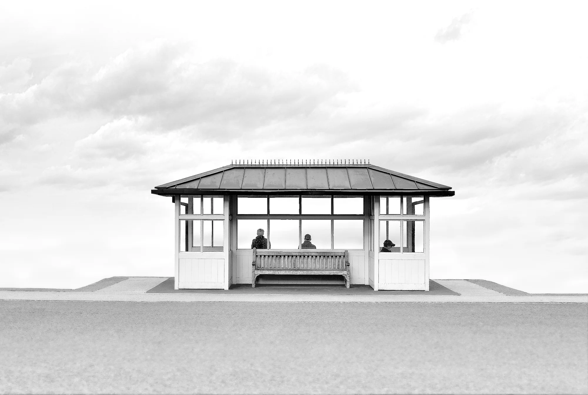
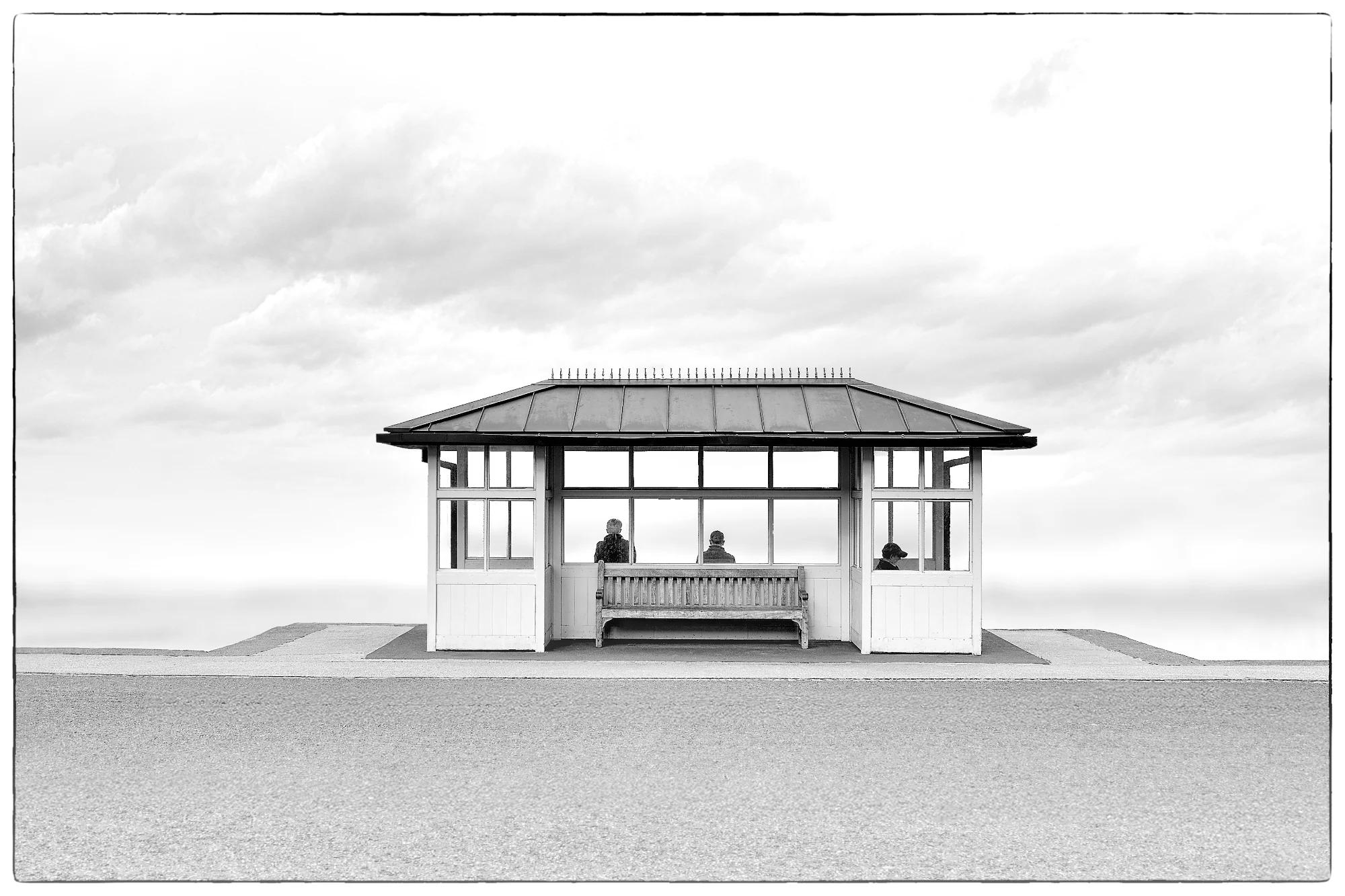
A highly successful revision. By addressing the minor distractions at the edges and in the foreground, the image now fully delivers on its surreal, minimalist intent.
What improved
- • Removed the distracting digital border
- • Eliminated the faint horizon lines to complete the high-key illusion
- • Smoothed the foreground texture to better match the minimalist aesthetic
Still to work on
- • The core composition and tonal conversion of the shelter itself
The Waiting Room
This revision successfully refines the surreal, minimalist atmosphere by stripping away previous distractions. The commitment to the high-key aesthetic is now fully realized, resulting in a striking and contemplative image.
What's Working
- ✓Strict symmetry and central placement anchor the surreal environment.
- ✓High-key processing effectively isolates the subject and creates an infinite void.
- ✓The silhouetted figures add a quiet narrative and sense of scale.
Room to Grow
- The artificial blur applied to the foreground creates a slightly abrupt transition line where it meets the sharp concrete base.low
- The ratio of foreground to sky could be slightly adjusted to emphasize the void further.low
Category Scores
✓ Perfectly balanced symmetry
→ The amount of empty foreground slightly outweighs the visual weight of the sky
✓ Seamless transition into pure white at the edges
✓ Clean, neutral black and white conversion
✓ Strong sense of isolation and contemplation
✓ Clean removal of the horizon lines
→ The masking line where the blurred foreground meets the concrete pad is slightly visible
✓ Transforms a mundane structure into a surreal concept
Your Action Plan
Top Actions
- 1Refine the masking on the foreground blur, using a softer brush to make the transition to the sharp concrete pad look natural.
- 2Consider a very slight crop from the bottom to reduce the amount of empty foreground and push the shelter slightly lower in the frame.
Need some inspiration?
Your style reminds me of...
Michael Kenna
Kenna's minimalist black and white landscapes often use long exposures and high-key backgrounds to isolate structures and create a similar sense of quiet surrealism.
Like what you see?