

Atanass
Lv. 2 · Critique by REVIEWR AI
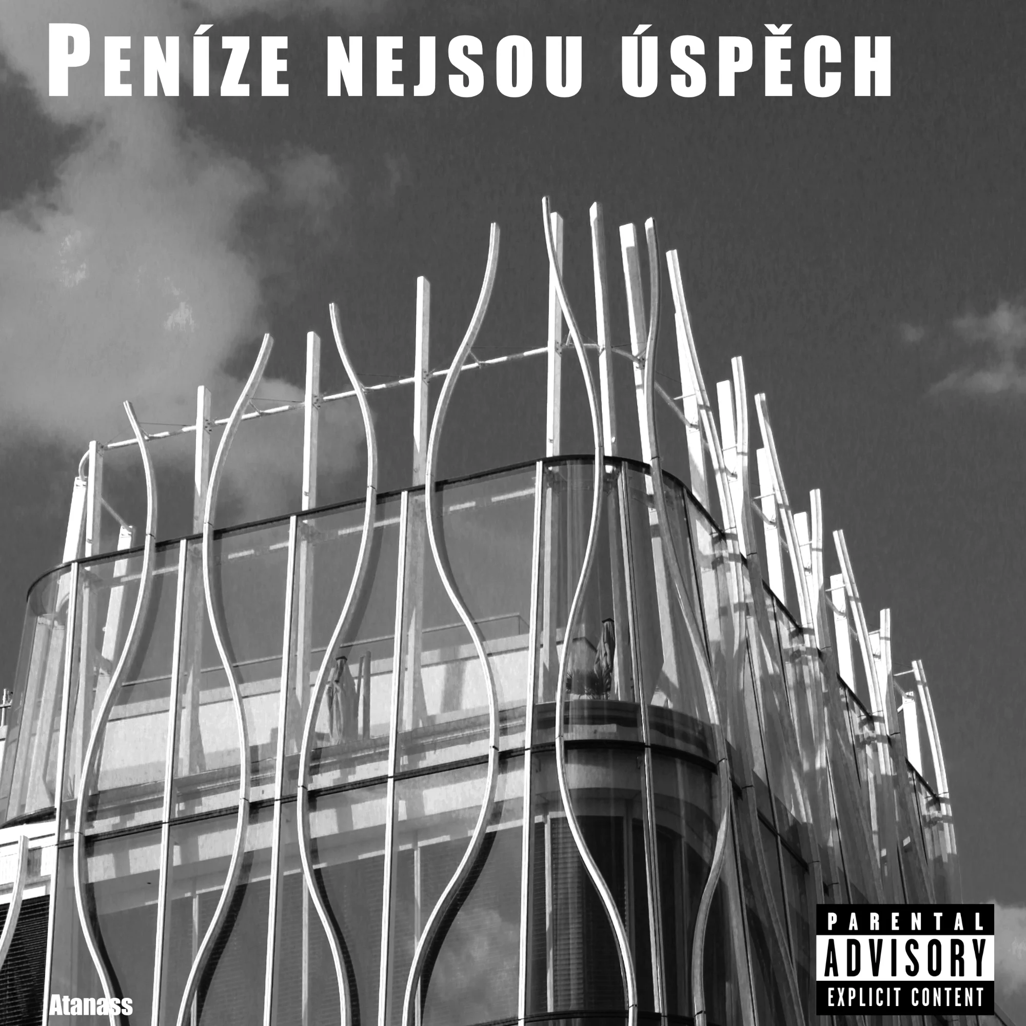
Album cover
While the heavy text overlays and graphics give this the feel of an album cover rather than a traditional photograph, the underlying architectural shot has some interesting graphic qualities.
What's working
- ✓Strong contrast in the black and white conversion emphasizes the structure.
- ✓Good use of the building's curved lines to create visual interest.
Room to grow
- Remove text and graphic overlays to allow the photograph to stand on its own.high
- The framing feels a bit tight on the edges of the building.medium
Category Scores
✓ The curved architectural lines create a strong graphic pattern.
→ The heavy text overlays completely disrupt the visual balance.
✓ Strong directional light highlights the white structural elements.
→ Some shadow areas inside the building lack detail due to the high contrast.
✓ The black and white conversion adds a stark, dramatic feel.
→ The overall tonal range is quite compressed, leaning heavily on pure blacks and whites.
✓ The stark contrast creates a slightly imposing atmosphere.
→ The mood is heavily dictated by the added text rather than the image itself.
✓ The main structural elements appear reasonably sharp.
→ The heavy graphics and potential compression artifacts make technical evaluation difficult.
✓ Choosing to render this in B&W emphasizes the geometric shapes.
→ The presentation as a meme/album cover distracts from the photographic intent.
Your Action Plan
TOP ACTIONS
- 1Remove all text and graphic overlays.
- 2Re-evaluate the crop to give the building more breathing room.
Need some inspiration?
Your style reminds me of...
Julius Shulman
Shulman was a master of architectural photography, using crisp black and white to emphasize the geometry and structural elegance of modern buildings without needing added graphics.
Like what you see?