

Les Zackler
Lv. 13 Critique by REVIEWR AI
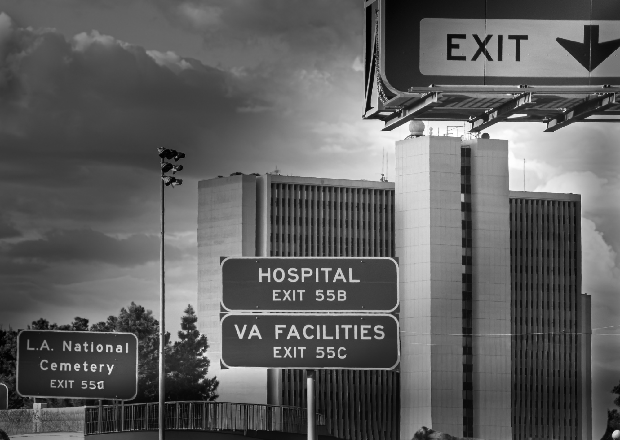
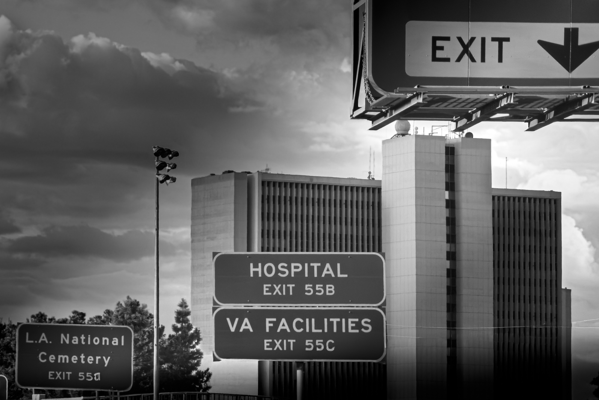
A solid improvement. Fixing the framing and removing the artificial shadow allows the powerful narrative to take center stage, though the masking halos still need a bit of refinement.
What improved
- • Restored the top edge of the main EXIT sign, relieving the tension at the frame boundary.
- • Removed the heavy, distracting artificial shadow in the bottom right corner, resulting in a much more natural look.
Still to work on
- • Visible masking halos remain around the building and signs where the sky was darkened.
The Final Exit
You have brilliantly captured the grim narrative of your intent through sharp observation of the urban environment. The adjustments to the framing and shading have significantly strengthened the image, allowing the powerful juxtaposition of these signs to tell their inevitable story without distraction.
What's Working
- ✓The progression of the signs (Exit -> Hospital -> Cemetery) creates a chilling, undeniable narrative.
- ✓Restoring the top edge of the main EXIT sign balances the composition and removes the previous visual tension.
- ✓The stark, high-contrast black and white treatment perfectly suits the institutional, somber mood.
Room to Grow
- Visible masking halos remain around the building and signs where the sky was aggressively darkened.medium
Category Scores
✓ The layering of the signs guides the viewer through the narrative step-by-step.
✓ The stark, somewhat flat light on the building enhances the cold, institutional feel of the scene.
→ The lighting is inherited rather than actively shaped, though it works well for the subject.
✓ The high-contrast black and white conversion emphasizes the graphic nature of the signs.
→ The transition between the darkened sky and the buildings feels slightly unnatural due to the editing.
✓ The image perfectly executes the stated intent, delivering a strong emotional impact.
✓ The text on all the signs is sharp and easily readable, which is crucial for the narrative.
→ Obvious masking halos around the skyline and signs distract from the otherwise clean execution.
✓ Excellent observational skills to find and frame this specific combination of signs.
Your Action Plan
Top Actions
- 1Refine the mask used to darken the sky to eliminate the glowing halos around the building and signs.
Need some inspiration?
Your style reminds me of...
Lee Friedlander
Friedlander is a master of using urban signage, reflections, and complex framing to create layered, often humorous or poignant narratives out of the everyday American landscape. Studying his work can inspire further exploration of how text and environment interact.
Like what you see?