

kyomu
Lv. 11 Critique by REVIEWR AI
🎯 Connection
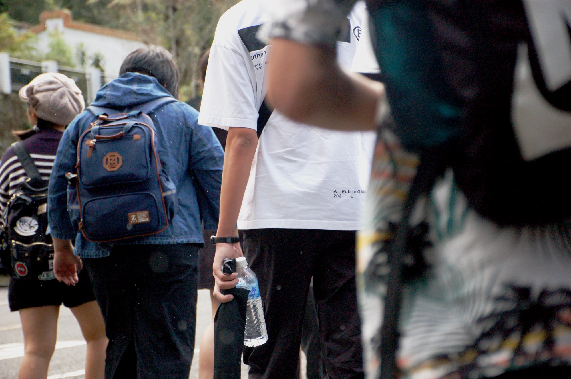
Your photo really captures the feeling of being right there in the middle of the group during your graduation trip. The rain adds a great atmospheric touch that brings your intent to life, and it fits the 'Connection' quest beautifully by showing this shared journey.
What's Working
- ✓The layered framing makes the viewer feel like a participant in the walk rather than just an observer.
- ✓The soft, overcast lighting perfectly matches the rainy day mood you described.
- ✓Details like the water bottle and the way the subjects are moving together tell a clear story of a shared moment.
Room to Grow
- The large, out-of-focus figure on the right takes up a significant portion of the frame and competes for attention.high
- The framing on the left is a bit abrupt, clipping the person in the striped shirt.medium
Category Scores
✓ Creates a strong sense of depth through foreground layering
→ The foreground figure on the right is overly dominant and blocks too much of the scene
✓ Soft, diffused light suits the rainy atmosphere perfectly
→ The flat light lacks direction, which reduces dimensionality
✓ The muted palette reinforces the dreary, rainy mood
→ Overall contrast is a bit low due to the atmospheric conditions
✓ Successfully conveys the shared experience of the graduation trip in the rain, fitting the quest theme
✓ Focus is accurately placed on the subjects in the middle ground
→ Raindrops or smudges on the lens slightly reduce overall clarity
✓ Shooting from within the crowd offers a more intimate perspective than standing back
→ The composition feels more accidental than deliberately structured
Your Action Plan
Top Actions
- 1Crop slightly from the right to reduce the visual weight of the blurred figure
- 2Add a touch of contrast to help the subjects stand out from the flat lighting
Need some inspiration?
Your style reminds me of...
Saul Leiter
Saul Leiter was a master at shooting through obstructions and capturing the mood of rainy days. Study how he used foreground elements to frame his subjects rather than block them, and how he embraced muted color palettes.
Like what you see?