

54
Lv. 3 Critique by REVIEWR AI
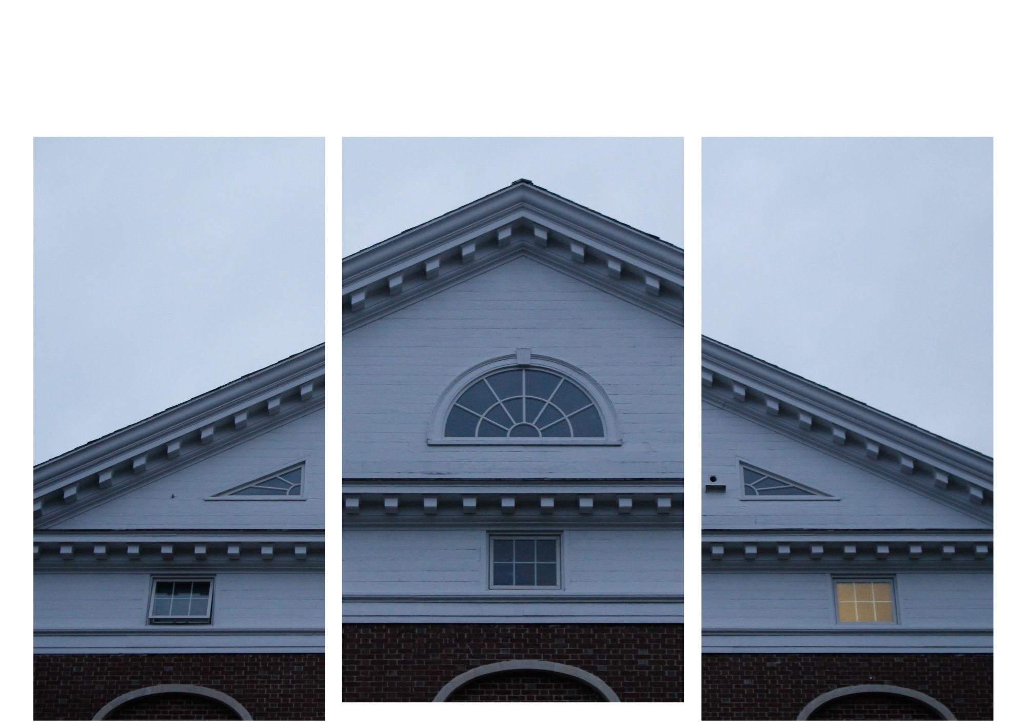
Triptych at Dusk
This triptych presentation turns a straightforward architectural facade into an engaging study of geometry and symmetry. The contrast between the cool, quiet exterior and the single warm window creates a compelling focal point, though refining the layout would make the final piece even stronger.
What's Working
- ✓The triptych format is a creative way to present architectural symmetry, forcing the viewer to examine the individual shapes.
- ✓The single lit window provides a crucial anchor of warmth, creating a classic and effective color contrast against the cool blue tones.
- ✓The muted, twilight lighting establishes a calm and slightly solitary atmosphere.
Room to Grow
- The white canvas borders are uneven, with excessive space at the top, which unbalances the overall presentation.medium
- The overall exposure is slightly dark, rendering the white building as a muddy gray.low
Category Scores
✓ Triptych layout adds visual interest to a static subject
→ Uneven white borders distract from the images
✓ Soft, diffused light prevents harsh shadows
→ The overall scene feels slightly underexposed, losing some pop
✓ Strong warm/cool contrast between the window and the environment
→ The white paint appears slightly gray and muddy due to the exposure
✓ Conveys a distinct feeling of quiet and stillness
✓ Focus is sharp enough to render the architectural details clearly
→ Visible noise in the sky and darker brick areas
✓ Choosing a triptych format elevates a standard architectural shot
→ The execution of the layout feels a bit unpolished
Your Action Plan
Top Actions
- 1Crop the overall canvas to create even, symmetrical white borders around the triptych.
- 2Increase the overall exposure slightly to brighten the white parts of the building.
- 3Apply mild noise reduction to smooth out the grain in the sky.
Need some inspiration?
Your style reminds me of...
Bernd and Hilla Becher
Their systematic, grid-like approach to photographing architecture shares your interest in geometry, framing, and objective presentation.
Like what you see?